
Creating an online store is about more than just setting up a website to sell products. To truly succeed and generate sales, you need to build a shop that provides an amazing digital customer experience. A key element of the customer journey is store design. Your Shopify store’s look, feel, and ease of navigation have a direct impact on conversion rates and overall business success.
However, knowing how to design a Shopify store can be challenging, especially when just starting out. You want to make sure you properly showcase your products while providing a seamless shopping experience.
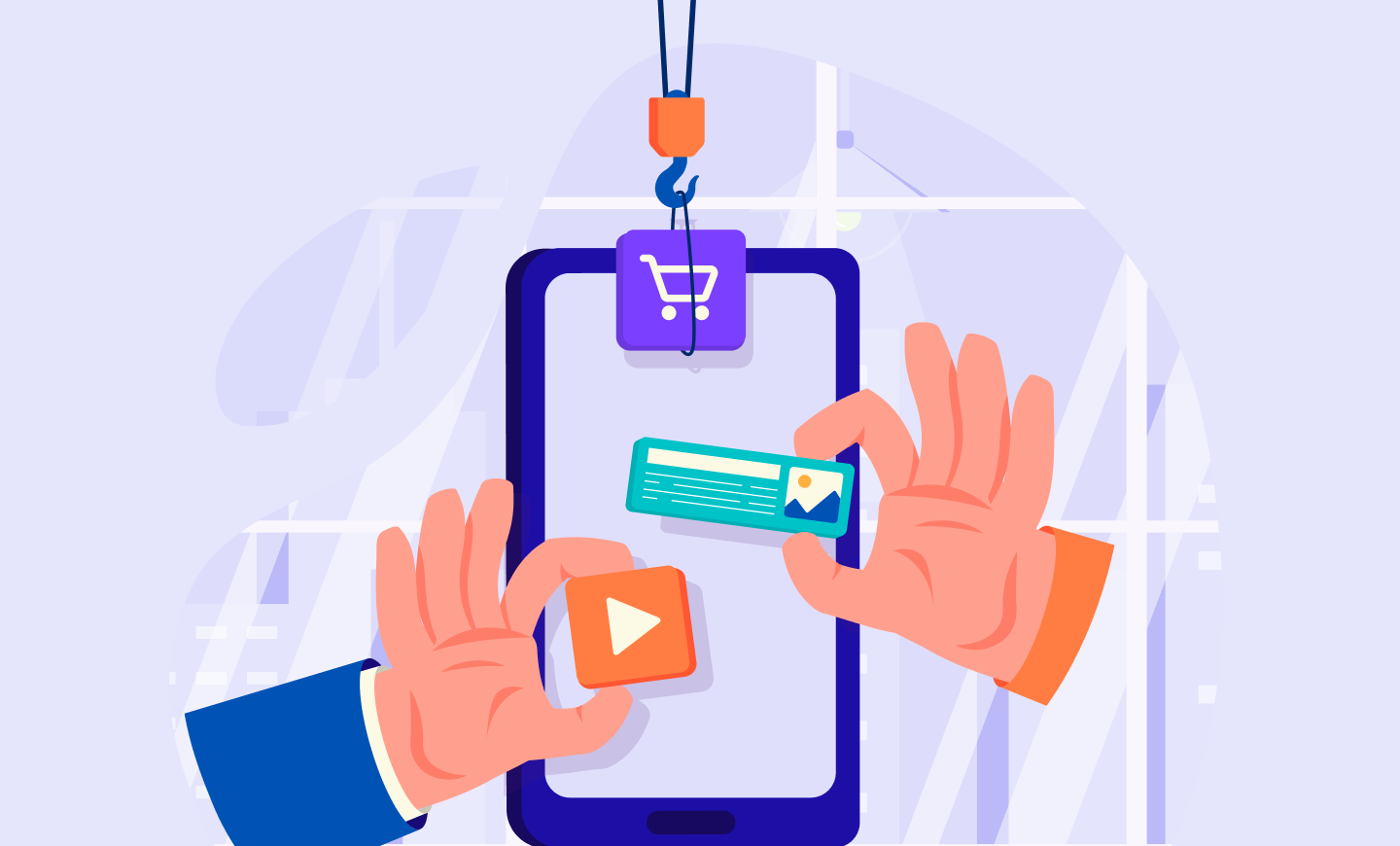
Are you launching a new Shopify store or looking to redesign an existing one? This comprehensive guide will help you knock this task out of the park. Let’s explore some of the most effective store design strategies:
1. Choose a visually appealing theme
The first step in designing your Shopify store is selecting an easy-to-use theme that also aligns with your brand style and image. It sets the overall look, feel, and functionality of your online store.
Shopify offers a wide variety of free and paid theme options with beautiful templates, responsive layouts, and powerful customization capabilities. Spend time browsing them and consider ones like Dawn, Prestige, and Be Yours as a starting point.
Consider the colour scheme used in theme templates. The colours should coordinate well with your brand logo and product images. For instance, an elegant, dark theme may suit a high-end fashion brand, while vibrant, light colours match a toy store. Install a few theme options to preview on your store before publishing.
2. Craft an intuitive navigation menu
After selecting a theme, the next area to focus on is your navigation menu. The main menu is one of the most important parts of Shopify store design. It allows customers to easily browse and find products or important pages like shopping carts.
Keep your primary navigation menu simple and scannable. As a best practice, have no more than seven to 10 top-level menu items. Any more can visually overwhelm customers and make it hard to quickly navigate your store.
Organize your menu categories and products in a logical order that matches your store sections. Group similar items together for easy browsing. Have menu item names match the corresponding page titles customers land on.
Test your navigation menus on both desktop and mobile. On mobile devices, the menu may change to an icon-based “hamburger” menu. Ensure it correctly collapses and expands menu items. Simple, easy-to-use navigation is crucial for increasing conversion rates.
3. Highlight top-selling and new products
Your main objective in any Shopify store is to make as many sales as possible. One way of ensuring this is by strategically highlighting your top-selling and new products within your store design. This can help directly guide customers to add popular, relevant items to their carts.
For example, create visually eye-catching announcements, banners, or sections on your homepage to promote best-selling items. Call it out specifically as a “Fan Favorite” or “Best Seller” to influence purchase decisions.
You can do something similar with new product arrivals. Add announcements or sections featuring trending or recently added inventory. This captures buyer interest for the latest items before awareness spreads.
For categories with lots of products, consider sorting by best sellers so those products appear at the top of category pages. Or create a separate page or section entirely and specifically dedicated to top sellers or items commonly purchased together.
Prominently displaying products that are already selling well or gaining popularity takes advantage of existing purchase signals. This implicitly recommends them to customers browsing your store, helping drive more conversions.
4. Guide customers with strong calls to action (CTAs)
These are links or buttons that prompt visitors to take a desired action, like “Add to Cart” or “Proceed to Checkout.” CTAs are a critical aspect of Shopify store design to actively guide customers through the purchase process.
Strategically place visible CTAs throughout product pages, the shopping cart, checkout, and any sales or promotional pages. Use action-driven button copy like “Buy Now,” “Shop New Arrivals,” or “Complete Purchase.” Match CTA language to where customers are within the buying journey.
Format your CTAs so they stand out on the page to capture visitor attention. Increase button size slightly compared to body text links. Use high-contrast colours like bright orange/green buttons on white backgrounds. Also, add borders or animations on hover to draw the eye.
Compelling CTAs urge customers to progress further into the purchase funnel at key locations. Ensure your Shopify store guides visitors along at every step with strategically designed and benefit-focused CTAs.
Conclusion
An effectively designed Shopify store has immense power to directly impact sales and revenue. Following core design strategies like choosing an on-brand theme, crafting easy navigation menus, highlighting best-selling products, and placing compelling CTAs guide customers to purchase. Keep your store design clean, simple, and conversion-focused for better results.
Leave a comment
This site is protected by reCAPTCHA and the Google Privacy Policy and Terms of Service apply.